

Replica Watch Look on Wrist Explained: How Visual Impact Changes When Worn
“Look on wrist” is not just about a watch’s specs on paper. The same case size can feel sleek on one wrist and oversized on another, while dial color and bracelet shape can make a watch appear thinner, wider, brighter, or more understated in real life. This guide breaks down the practical visual factors that decide how a replica watch presents when you actually wear it—so you can judge fit and style with more confidence.
1) Why “look on wrist” can’t be predicted by case diameter alone
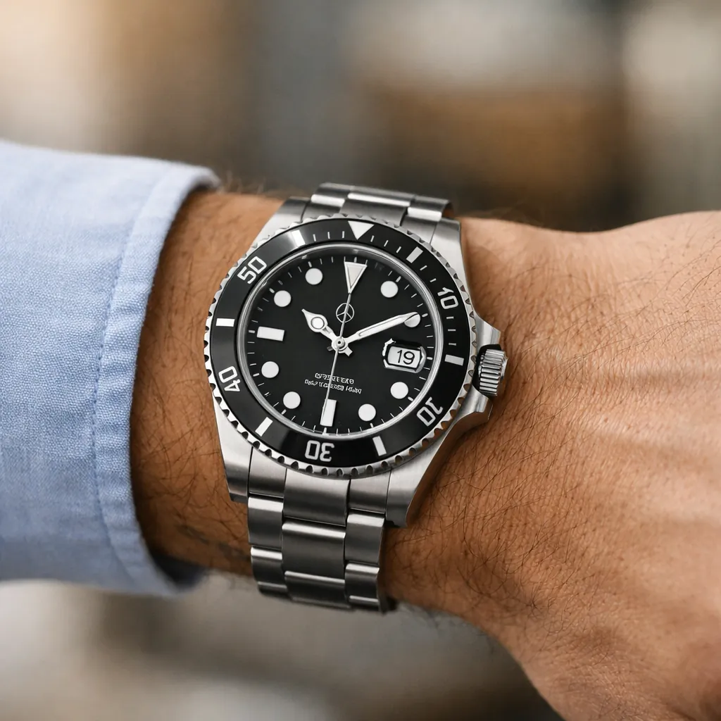
When people search “replica watch look on wrist explained,” they usually want a simple answer like: “Is 41mm too big for me?” In practice, diameter is only one piece. Watches are 3D objects, and wrists are curved surfaces. What your eye reads first is the overall silhouette: how far the lugs extend, how the case height sits above the wrist, and how the bracelet or strap frames the case.
Two watches with the same diameter can feel completely different. A slim bezel and open dial can make the face look larger; a thicker bezel can visually “contain” the dial and make it look smaller. Similarly, a watch with a short lug-to-lug length can wear compact even if the diameter looks large on paper.
2) The 7 visual factors that change impact on wrist
A) Lug-to-lug length (the real wrist span)
Lug-to-lug is the distance from the tip of the top lug to the tip of the bottom lug. If the lugs approach the edges of your wrist (or overhang), the watch looks and feels much larger. If they stay comfortably within the wrist’s flat area, the watch reads balanced. In daily wear terms, this is often the “make or break” measurement for visual comfort and proportion.
B) Thickness + case side shape (how “tall” it reads)
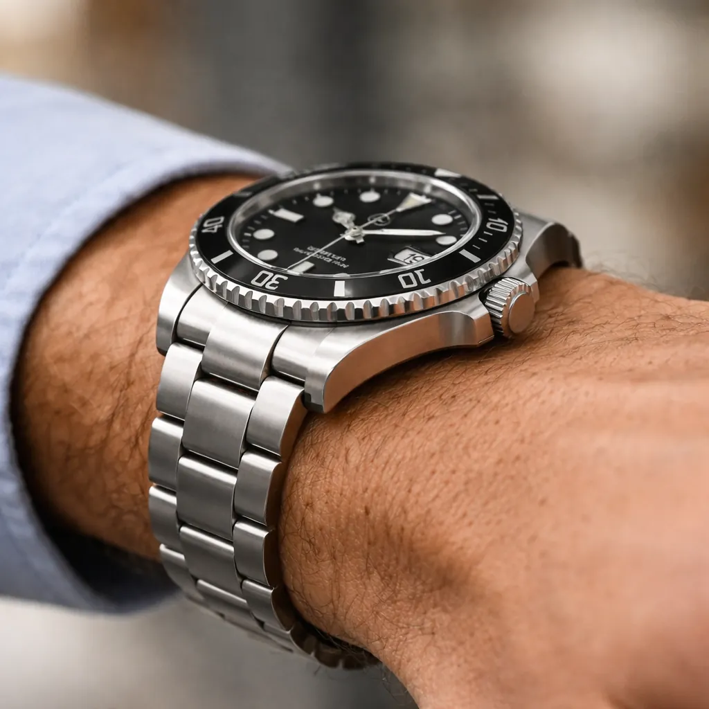
A watch’s thickness matters, but so does how the case is shaped. Straight sides look taller; curved sides can visually reduce height. A polished case flank catches light and can draw attention to thickness, while brushed surfaces feel quieter. If you wear long sleeves often, thickness also affects how smoothly a cuff slides over the watch.
C) Bezel-to-dial ratio (dial openness)
Bezel width changes perceived size instantly. A thinner bezel shows more dial, which looks larger and more modern. A thicker bezel shrinks the dial opening, creating a tighter, sportier frame. This is why two “same diameter” watches can read as different categories on wrist—one sleek and expansive, the other compact and tool-like.
D) Dial color + finish (contrast and “presence”)
Dark dials usually look smaller and calmer; light dials look bigger and brighter because they reflect more ambient light. Sunburst finishing can add dynamic shine in movement, while matte dials reduce glare and feel more understated. If your goal is an everyday, flexible look, dial color is one of the easiest levers to control visual impact.
E) Crystal clarity + reflections (how “clean” the face looks)
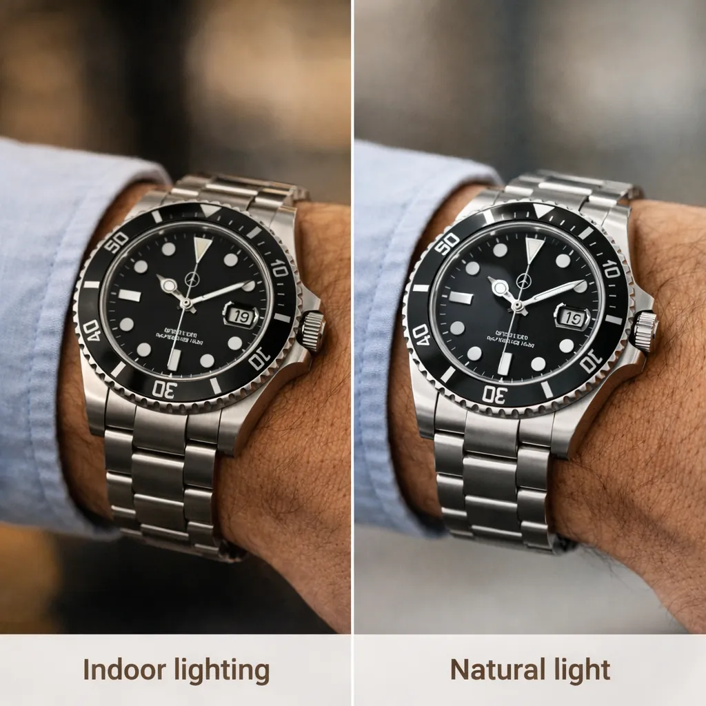
On wrist, the dial is seen through the crystal. Reflections can either add luxury sparkle or obscure details, depending on lighting and viewing angle. A clean, readable dial surface tends to feel more refined in photos and in person. If you care about what the eye notices first, it helps to understand visual priorities and where attention naturally goes.
F) Bracelet/strap geometry (the frame around the case)
Bracelets with strong taper (wider at the lugs, narrower at the clasp) often look more elegant and “designed,” while straighter bracelets feel chunkier and sportier. Strap material matters too: leather can soften the look, rubber can modernize it, and metal bracelets can emphasize shine and structure—especially under indoor lighting.
G) How it sits (fit, balance, and micro-adjustment)
Even a great design can look off if the watch constantly slides down toward the hand or rotates. A centered, stable position makes the dial appear intentional and symmetrical. If a bracelet has good fit and the clasp sits cleanly, the whole watch reads “finished” rather than improvised.
3) A practical “mirror distance” test (fast, realistic judging)
Many wrist shots online are taken close to the camera, which exaggerates size. To judge real-world impact, try this: stand in front of a mirror and let your arm hang naturally at your side. Step back 1.5–2 meters and look at the watch as part of your whole outfit. This reduces perspective distortion and shows what others actually see in conversation distance.
- Angle test: rotate your wrist slightly—does the watch look balanced from multiple angles?
- Sleeve test: put on the jacket/shirt you wear most—does it catch on the case?
- Movement test: walk, sit, type—does the watch stay centered without constant adjustment?
4) Style scenarios: choosing the “right presence” (not just the “right size”)
“Better” is context-dependent. A watch that looks bold in a close-up might be perfect for casual outfits, while a subtler profile can be more versatile across work, travel, and formal settings. Think in terms of presence:
5) How to take (and interpret) “on wrist” photos correctly
If you rely on photos to decide, use consistent conditions so you’re comparing fairly. Camera distance is the #1 issue: a phone held 20–30cm from the watch will make it look bigger than it appears to people. For a more honest shot, step back and use 2x zoom, or ask someone else to take the photo from chest distance.
6) A simple checklist before you decide
- Start with wrist comfort: lug-to-lug should stay within the wrist’s flat area for the cleanest silhouette.
- Decide your presence level: do you want subtle, balanced, or bold? This guides bezel/dial choices.
- Match your wardrobe: bracelet shine and dial color should complement what you wear most.
- Judge from real distance: mirror distance beats close-up wrist shots for realistic sizing.
- Prioritize readability: clarity and contrast affect how “premium” the watch reads at a glance.
If you want to go deeper on how the eye evaluates details in real wear, you can continue with replica watch visual accuracy explained .