

Replica Watch Visual Accuracy Explained: What the Eye Really Notices
Most people judge a watch in layers: silhouette first, then dial layout, then the details that only appear under longer viewing. This guide focuses on what the eye reliably notices in real life—at arm’s length, in motion, and under mixed lighting.
What Visual Accuracy Means (In Real-World Viewing)
Visual accuracy is how closely a watch matches a reference model’s appearance under normal wear conditions. That matters because most watches are seen through reflections, at angles, and briefly. A watch can look convincing day to day while failing macro comparisons. The reverse can also happen: strong close-up photos, but an “off” feeling on the wrist due to proportions or finishing behavior.
Think in three layers: (1) silhouette accuracy, (2) dial grammar, and (3) detail accuracy. If the first two layers are strong, the watch tends to read correctly in everyday life.
Layer 1: Silhouette Accuracy (The First Two Seconds)
The silhouette is the fastest cue. People may not know why something looks wrong, but they sense it immediately. This layer is dominated by geometry and proportion—more than engraving or small text. If you want a structured way to judge thickness, lug-to-lug, and bezel-to-dial balance, see this case proportion comparison.

- Case diameter vs. thickness: Even minor thickness differences alter perceived quality.
- Lug-to-lug length: Affects how compact or stretched the watch appears on wrist.
- Bezel-to-dial ratio: One of the quickest ways the eye identifies model correctness.
- Crown size and seating: Incorrect proportions stand out most in side views.
Layer 2: Dial Grammar (How the Brain Reads the Face)
After silhouette, the eye reads the dial like a layout system. Humans are sensitive to spacing and symmetry even when they can’t explain what’s wrong. “Dial grammar” is about balance, alignment, and visual logic.

Alignment and symmetry
- Index spacing: Uneven distances subtly disrupt visual harmony.
- Hand-to-marker alignment: Hands should visually land where the dial expects them to.
- Chapter ring alignment: Misalignment is easy to notice because it breaks symmetry.
Typography and print weight
Fonts are shapes, not just letters. Stroke thickness, sharpness, and spacing all affect whether dial text feels confident or generic. For a deeper breakdown of what “sharp printing” looks like in practice, read this guide on dial printing and font accuracy.
Date Window Geometry
Date windows are high-attention zones. People glance at them more than they realize. Incorrect placement, mismatched font size, or off-centering quickly undermine visual credibility. For a simple checklist on placement and centering, see the date window alignment guide.
Layer 3: Detail Accuracy (What Appears Under Longer Viewing)
These details matter most after the first impression. They rarely decide instant recognition, but they determine whether the watch holds up under repeated wear—especially under bright light and in close conversation.
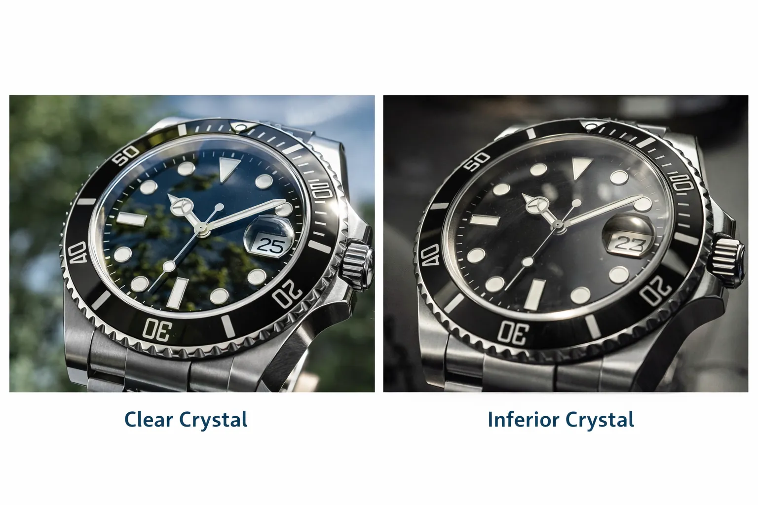
Crystal behavior is a quiet differentiator: glare level, clarity at angles, and perceived depth can change how premium a watch looks. To understand why reflections vary, this overview of anti-reflective coating technology is a useful reference.

- Bezel alignment: Misaligned markers create ongoing visual distraction.
- Case finishing transitions: Clean borders between brushed and polished surfaces matter more than decorative micro-text.
- Lume application: Uneven lume can be easier to spot than expected.
- Bracelet integration: Gaps or mismatched finishing break the cohesive look on wrist.
What the Eye Notices Most: A Practical Priority Order
- Overall proportions and silhouette
- Dial alignment and symmetry
- Surface behavior under light
- Typography weight and sharpness
- Micro-details and engravings
This is why “visual accuracy” debates often differ by watch family: different designs emphasize different priorities (bezel presence, dial balance, case stance, or bracelet integration). If you’re comparing how these priorities show up across a single brand’s line, browsing various Rolex watch families can help you notice how silhouette and dial grammar change from model to model—without relying on macro-only comparisons.
Tip: For the most realistic evaluation, judge at arm’s length first, then confirm alignment in three zones (12 o’clock, hand behavior, date), then test in soft indoor light and bright light. Consistency matters more than microscopic perfection.