

Replica Watch Font Accuracy Explained: Typography and Visual Details
A visual-first guide to reading typography on a watch dial—letter shape, spacing, alignment, and application—so you can evaluate details with a clearer framework.
When people compare watch accuracy, they often talk about the obvious: overall finishing, proportions, or surface shine. But typography is different—fonts sit at the center of attention, and even minor deviations in letterforms or spacing can change how “correct” a dial looks at a glance.
How to use this guide: treat fonts as a visual system. Look for consistency in shape, spacing, alignment, and edge quality—not just whether the text exists.
What “Font Accuracy” Really Means
Font accuracy describes how closely dial typography matches the intended design: letter proportions, stroke thickness, spacing between characters, and placement relative to indices or center axis. Because text is highly structured, our eyes catch irregularities quickly—even without technical knowledge.
- Letterforms: shapes, angles, curves, and terminals
- Stroke weight: thick/thin balance across the word
- Kerning & tracking: spacing inside a pair of letters and across the line
- Baseline & centering: alignment to the dial’s geometry
- Application: printed vs engraved clarity
Why Typography Changes the Whole Look
Typography affects perceived realism because it sits in the most visually “readable” area of a dial. A word that is slightly too bold, too wide, or not centered can disrupt balance even if everything else looks correct.
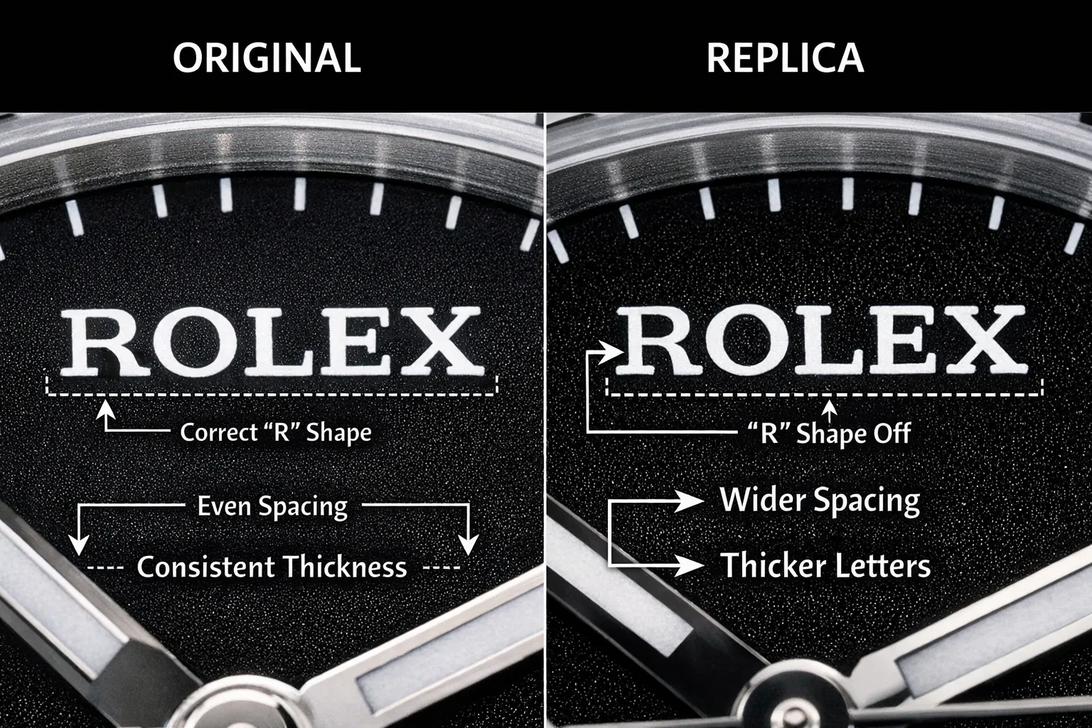
Where Font Differences Show Up Most
1) Logo letterforms
Logos often use proprietary letterforms. Look for the “signature” shapes—curves, serif angles, and the relationship between vertical strokes and bowls. A single off-shape letter can make the whole word feel unfamiliar.
2) Dial text lines (model text, depth ratings, etc.)
Secondary text reveals production consistency: uneven thickness, fuzzy edges, or non-uniform spacing typically stands out more under close inspection than under normal viewing distance.
Printing vs Engraving: Micro-Edge Clues
Font accuracy is not only design—it’s also execution. Printed text depends on ink density and edge sharpness, while engraved text depends on consistent depth and clean contours.

Alignment & Spacing: The “Invisible” Tells
Two dials can use similar letter shapes, but alignment often separates a clean, intentional look from one that feels slightly “shifted.” Check whether the logo and text lines are centered to the dial axis and sit at consistent distances from indices.

Date Numerals: Small Window, Big Signal
Date numerals are highly structured and easy to compare. Look for number width, proportion, and centering within the window—minor changes can alter the perceived “font family” immediately.
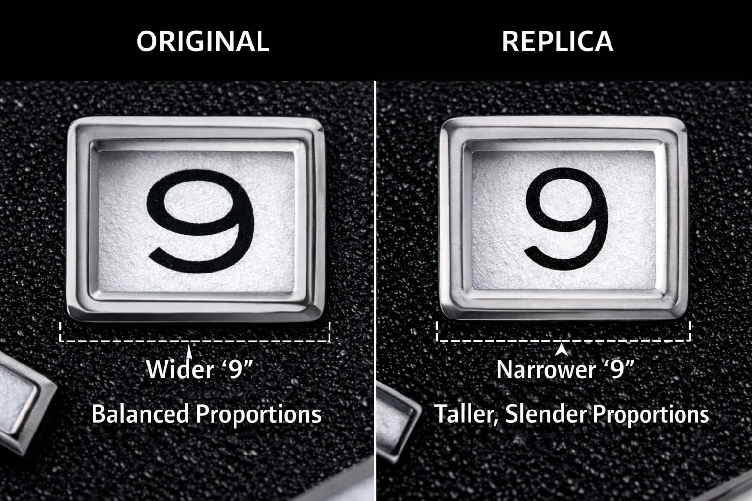
A Practical Way to Evaluate Fonts
Instead of trying to memorize exact fonts, evaluate typography as a consistency set: shape (letterforms), spacing (kerning/tracking), alignment (center axis), and edges (print/engrave quality). The more coherent these elements are together, the more stable the dial looks over time.